🚀 CSS Essentials for styling web frontends
Tags: Selectors, Colors, Box Model, Text & Fonts, Flexbox & Grid Layout, CSS Units
🎯 Purpose
Controls the style and layout of HTML elements (colors, fonts, spacing, positioning).
🌱 Origin
Introduced by Håkon Wium Lie in 1996.
Name = Cascading Style Sheets → describes how styles “cascade” from multiple sources.
🧠 Essentials
→ CSS Documentation: developer.mozilla.org/en-US/docs/Web/CSS
🎨 Selectors
/* Select by element: */ p { color: blue; }
/* Select by class: */ .myClass { background: yellow; }
/* Select by id: */ #myId { font-size: 24px; }
🎨 Colors & Backgrounds
- Examples
.myClass { background: linear-gradient(to right, red, orange); }
body {
  background-color: #f0f0f0;
  color: #333;
}- RGB (Red, Green & Blue): a color model where these 3 primary colors of light are combined in various intensities to create a wide spectrum of colors on screens.
#f0f0f0 = rgb(240, 240, 240)
🔤 Text & Fonts
h1 {
  font-family: Arial, sans-serif;
  font-size: 20px;
  text-align: center;
  line-height: 20px;
  text-decoration: underline;
}
📏 Box Model
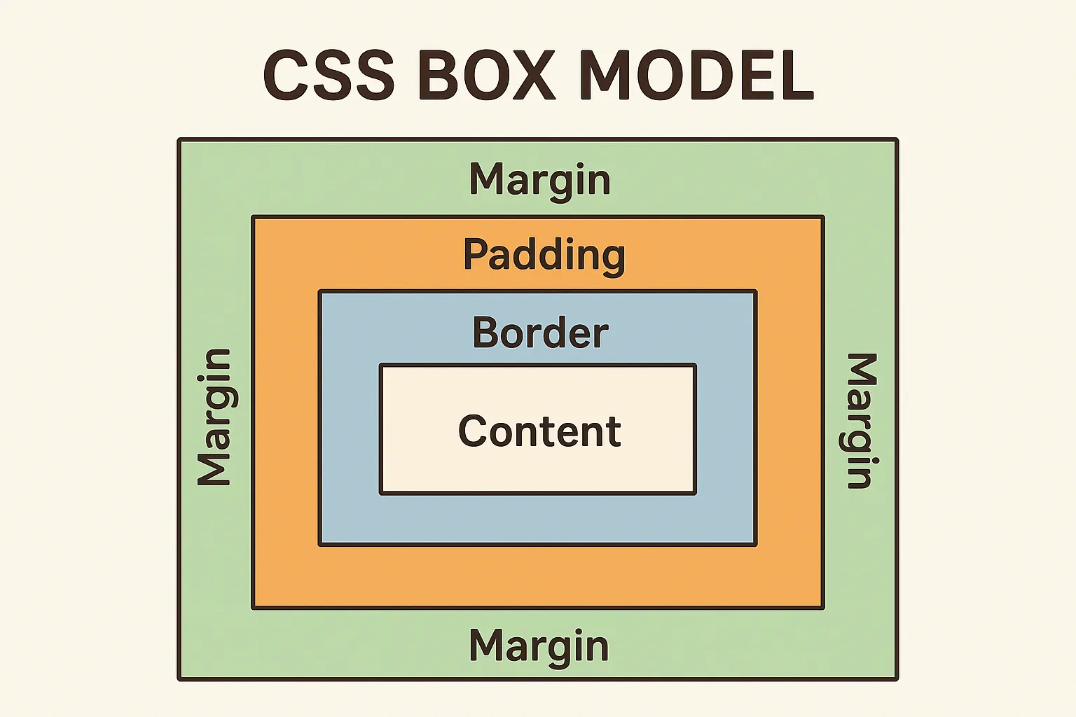
div {
  width: 200px;
  border: 2px solid black;
  padding: 10px; /* inside ([P]rotects content) */
  margin: 20px; /* outside ([M]oves box away from others)*/
}
🔗 Links & Buttons
a {
  color: blue;
  text-decoration: none;
}
a:hover { text-decoration: underline; }

button {
  padding: 10px 20px;
  background: green;
  color: white;
  border: none;
  border-radius: 5px;
}
📐 Layout (Flexbox & Grid)
.flex_container { /* Flexbox */
  display: flex;
  justify-content: space-between;
  align-items: center;
  flex-direction: column; /* vertical stack  */
}

.grid_container { /* Grid */
  display: grid;
  grid-template-columns: 1fr 2fr;
  gap: 10px;
}
🧩 Reusability
:root {
  --main-color: teal; /* define variable */
}

.btn {
  background-color: var(--main-color); /* use variable */
}
📍 Positioning
<div class="static">Static</div>
<div class="relative">Relative</div>
<div class="absolute">Absolute</div>
<div class="fixed">Fixed</div>
<div class="sticky">Sticky</div>
.static { position: static; background: gray; }
.relative { position: relative; top: 10px; left: 10px; background: teal; }
.absolute { position: absolute; top: 10px; left: 220px; background: crimson; }
.fixed { position: fixed; top: 10px; right: 10px; background: orange; }
.sticky { position: sticky; top: 0; background: purple; }
div { width: 100px; height: 50px; color: white; margin: 10px; display: flex; align-items: center; justify-content: center; }⚖️ Core CSS Units
pxstands for pixels, a fixed, absolute CSS unit.
1px= 1 dot on the screen (depends on device resolution).- Does not scale with parent or root font size (Unlike
em/rem). - ✅ Use
pxwhen you need fixed, exact sizing (commonly for fonts, margins, borders, & layout). - Example:
p {
  font-size: 16px; /* exactly 16 pixels high */
  margin: 10px;    /* exactly 10 pixels spacing */
}emis a relative CSS unit based on the font-size of the parent element. It stands for “M-width” of a typeface, referring to the width of the uppercase letter M in the current font.
1em= 100% of the parent’s FS =>2em= 2 × parent’s FS.- ✅ Useful for scalable, responsive sizing of fonts, padding, and margins.
- Example:
.parent { font-size: 16px; }
.child { font-size: 1.5em; } /* 16px × 1.5 = 24px */remstands for “root em” and is a CSS unit relative to the root (<html>) font size.
1rem= 100% of the root FS (default is usually 16px in browsers). =>2rem= 2 × root FS.- Does not depend on the parent element (Unlike
em). - ✅ Great for consistent sizing across the page and responsive design.
- Example:
html { font-size: 16px; }  /* root size */
p { font-size: 1.5rem; }   /* 16px × 1.5 = 24px */
All cheat sheets are taken from our Udemy Online Course. Interested? Check out:
All-In-One Full Stack DevOps - From Idea to Cloud